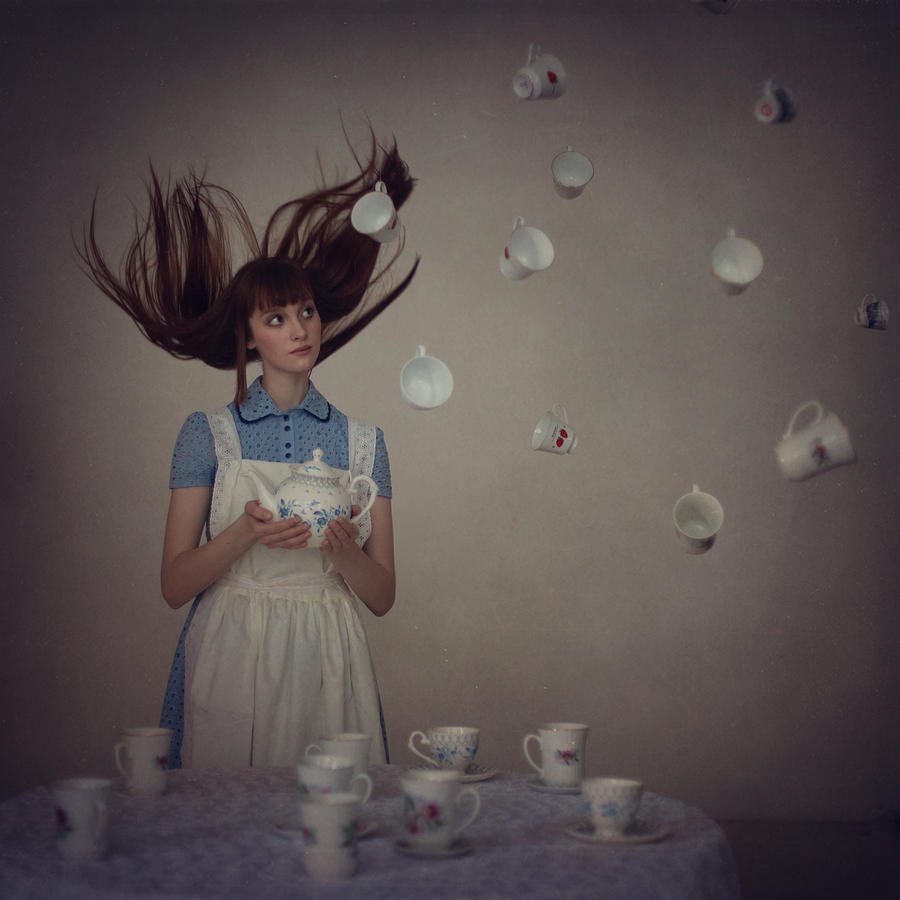
Inspiration: Anka Zhuravleva
Tuesday, December 12, 2017
Monday, November 27, 2017
Assignment #20: Surreal
Real is happening and looks possible but surreal is like a dream, where everything looks real even though it may be bizarre to look real.
When someone says, "That's so surreal," they are saying that something looks or feels real even though it is strange to be real. For example, in my dreams I may see a giant mouse or a tiny lion which are surreal because in my mind they seem real but it makes no sense for them to be real.

This photo was taken by Anka Zhuravleva. I like her use of levitation in her photographs and the subtle look of it all.

This photo was taken by Joel Robison. I really like how his images compare shapes and sizes within them.

I was inspired by Joel Robison's work to capture a surreal photo comparing shapes and sizes. In this photo, I achieved this concept by using distance to make it appear as though one of the girls is either very tiny or the other girl is very large.

This photo was taken by Anka Zhuravleva. I like her use of levitation in her photographs and the subtle look of it all.
This photo was taken by Joel Robison. I really like how his images compare shapes and sizes within them.

I was inspired by Joel Robison's work to capture a surreal photo comparing shapes and sizes. In this photo, I achieved this concept by using distance to make it appear as though one of the girls is either very tiny or the other girl is very large.
Assignment #18: Aaron Siskind
In a lot of Siskind's work, his images are black and white like the image above. He also seems to add a lot of clarity to his images to really show the shapes and patterns like I tried. In my image, I also tried to capture shapes, patterns, and textures of the wood and the window like Siskind does.
Tuesday, November 7, 2017
Thursday, November 2, 2017
Assignment #15: Light
The hardest part of this assignment was trying to find or create really sharp shadows. However, the most interesting was when I put down the pumpkin and how there were many shadows and values of light. I think because of that, the image of the pumpkin was the most successful.
Friday, October 20, 2017
Wednesday, October 18, 2017
Monday, October 9, 2017
Tuesday, October 3, 2017
Friday, September 29, 2017
Wednesday, September 27, 2017
Assignment #7: What color are you?
This image shows the color white. I chose the color white to represent me because I can be shy and quiet at first. However, when you think about it, white light is made of all of the colors of the rainbow which is how I feel I am. I don't think that I can represent just one color because I feel like I am really weird so that I can't just choose one color. I am blue because I am calm, I am red because I am tough, I am pink because I am animated, and etc.
Assignment #6: Polar Opposites
My goal of this assignment was to focus on and compare the polar opposites of single and fire. I wanted to capture one individual light that shines brightly and multiple lights that shine together. I think I did very good at capturing that one flame however, I feel like I could improve on the many lights. I felt that the lights should have been closer together and that there should have been more but there wasn’t much I could do. Although the polar opposites are suppose to be single and many, I feel like 2 photos can have many polar opposites. For example, I think these images compare real and fake or natural and unnatural as in light. The fire is a real and natural source of light but the lights are made with other materials like glass and are more unnatural.
I feel that the polar opposites, single and many, are not thought about as much. Many think about water and fire, moon and sun, light and dark, but I feel that single and many are important opposites. To me, the photos somewhat compliment each other because I see a group of people that are the lights and one individual that is the flame. I can see the two photos put together with the flame in the center and the lights surrounding the flame. I think polar opposites come together because like a magnet, you can’t have two similar things together since it makes the whole thing look plain. However, opposites attract and two opposites bring more style and contrast together.
Monday, September 25, 2017
Thursday, September 14, 2017
Assignment #5 (taken by photographer)
I selected this image because it is interesting to see how the photographer is able to capture some depth in there image. It is texture-perfect because the many rings of wood really show texture especially as it spirals in and becomes 3-D. This photograph was taken by Brett.
Assignment #5 (taken by photographer)
I selected this image because I love how there are two different surfaces with different textures. It is texture-perfect because the surfaces combine together and compliment one another even though they are different. This photograph was taken by Richard.
Assignment #4: Composition- Rule of Thirds
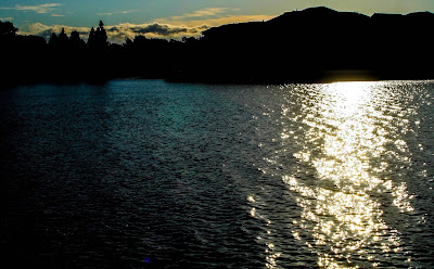
ISO 100 f/10 1/1000 Manual
This photo, to me, shows strong composition because it shows rule of thirds. As the sun began to set, the light reflected onto the water and lights up the dark blue water. The clouds in the background bring peacefulness just like the reflection of the sun on the water which brings hope.
Assignment #4: Composition- Contrast
ISO 100 f/10 1/80 Manual
I think this photo has strong composition because contrast is included. I love the color of the water because it really pops out. Also, the way the light shines on the rocks and casts shadows is quite interesting to observe.
Assignment #4: Composition- Symmetry
ISO 400 f/10 1/20 Manual
I think that this photo has strong composition because it shows symmetry. The sharpness of the white lines really stand out which I like. In addition, I like how the two leaves seem exactly the same but the lines on them are unique.
Monday, September 11, 2017
Thursday, September 7, 2017
Tuesday, September 5, 2017
Subscribe to:
Comments (Atom)


